Your résumé often creates an employer’s very first impression of you as a candidate. Undoubtedly, you have labored over how to format the content effectively, and you have worked to highlight your accomplishments while using strong, active verbs. But, have you thought about your font? Perhaps you should, especially considering that a Bloomberg article recently described Times New Roman as the “typeface equivalent of wearing sweatpants to an interview”. That is a pretty harsh review for a classic font that has often been considered a safe choice.
The only real rule about your chosen font regards size. Your résumé font size should be between 10 and 12. This obviously excludes headings like your name, which should be the largest font on your document, and subheadings like your “Education” and “Experience” sections, which are usually between the sizes of 12 and 14. Do not go smaller than 10 point font on your résumé, even if you are trying to fit everything on one page!
Ultimately though, your résumé font is your own style choice and there are hundreds from which to choose. There may be no firm rules about resume font styles, but you should probably stick with the two most recommended font families – Serif and Sans Serif. At this moment, you might be asking yourself, “Wait, fonts have families?” Yes, apparently they do, and a website called Weemss includes a nice infographic on “The Psychology of Fonts” with an overview of all the font families, the associated fonts, and then a list of properties commonly associated with each font. What was their take on Times New Roman? It suggests that you are “reliable”.
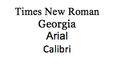
Fonts in the Serif font family have tails on the ends of their letters; whereas, the Sans Serif fonts are missing the tails. Popular Serif fonts include: Georgia, Garamond, and even the “sweatpants equivalent” Times New Roman. Popular Sans Serif fonts include: Arial, Verdana, and Helvetica. In the same article that bashed Times New Roman, Helvetica came out as a winner. It was touted as the clear choice for professional fonts. The only problem is that the latest version of Microsoft Word doesn’t list Helvetica as a drop down option. You actually have to manually type it in, but then it does seem to be recognized.
For your résumé, it is best to sidestep fun or overly stylized options. They can come across as juvenile and, worse, some are hard to read. Avoid any fancy script-type font; save that for your wedding invitation. And, time and again, Comic Sans showed up on almost every list of poor font choices.
Now, go open up your résumé. Which font did you use? What fonts tend to be your favorites? Let us know by commenting below.


